|
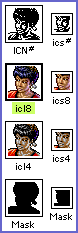
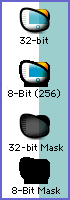
Introduction Let's face it - you love icons! You collect icon sets, spend hours scouring the Web for new releases, and constantly tweak the interface on your Mac to reflect your mood. It's too much fun! However, sometimes you reach a point where collecting icons and icon sets isn't enough. You get an inspiration to make your own. But suppose you have never made an icon before - where do you start? Don't be discouraged! Each month, this column will provide you with another installment of practical how-to knowledge concerning icon construction, starting at the beginner level and working up to advanced techniques and tricks. We'll walk you through planning your icon, picking the right tools, utilizing drawing techniques and understanding design philosophies. Also, from time to time, we will have special interviews with icon artists and engineers! So, let's jump right into Part One: Understanding Icons What is an icon? Technically, an icon is a System-level resource that uses a combination of a bitmap graphic and a mask to create a small picture that is attached to a file or program on your Mac. The part of the resource where the bitmap graphic is stored actually contains several versions of the graphic, each one being used by the system depending on how many colors your Mac can display. The mask is literally a mask - the System uses it as a stencil or silhouette to "knock" a hole in the screen's image display that your artwork can be shown through. This is why it's important that the artwork and mask match - otherwise, some parts of your masterpiece might not show up! On a more basic level, an icon is a tiny pixellated condensation of an idea - reduced to something that is quickly recognized by your eye, perhaps more quickly a file name which must be read. For example, you can probably spot a bright yellow smiley face on your desktop much faster than you can find a folder name that reads "Smiley". Icons can represent anything you want - they can be custom-styled folders or pictures of your favorite Japanese pop star - but ideally they should be able to be understood at a moment's glance. What's this about "versions" and color display? Every Mac system from the original Mac 128k to the new iBook has the capability to display a certain amount of color on it's screen. In the case of the Mac 128k it only black or white, or 1-bit color. The Mac II's introduced 16 basic colors, or 4-bit color. The next jump was to 256 colors, then thousands, which are called 8-bit and 16-bit respectively. The Mac operating systems before System 8.5 use a type of icon resource that contains a separate version of the icon art for each bit depth up to 8-bit (Fig. 1), although luckily they all use the same mask. In addition, there are two ways to view files on a Mac, regardless of System version: Icon View, where you see the 32x32 pixel icons, and List View, which uses a smaller 16x16 version. So that's 3 bit-depth versions at 2 sizes each, plus a mask for both sizes - 8 pieces of art total - all stored in a resource called an "Icon" resource (Fig. 2). Never heard of one? Well, if you've ever copied and pasted an icon in the Finder using get info, you've already used "Icon" resources! Mac OS 8.5 changed all this by beginning the use of a new type of icon resource - the "icns" resource. It can store all 6 of the old-style versions and their masks, plus a new type of icon called 32-bit, which uses millions of colors! The new mask format can also use transparency, enabling the creation of icons with soft edges and dazzling see-though effects (Fig. 3). The interesting part is that, with this new resource, it is possible to just use one 32-bit version of the artwork and one mask. The only drawback to doing this is that a person using anything less than System 8.5 can't see it. Of course, if you are making your icon just for yourself and you use 8.5 or higher, then you don't have to bother with these lower bit depth versions if you don't want to. It's up to you, but if you include both of these resource types in one icon, then everyone can join the party, no matter what OS they have! We'll cover this in more detail down the line... Hey, I just want to make an icon, pal! Okay, okay - I know this is dry stuff, but it is important to understand how icons work if you want your icon to function correctly - and especially if you plan to release it to the world! Don't forget that an icon is really a tiny piece of software, and if you understand how it does it's job, your icon will be technically competent, regardless of the subject matter. Do I really have to make all that stuff? No, not by yourself! To begin your icon, you can easily start with the minimum - the 256-color version at 32x32 pixels. All system versions will be able to see it, and all icon-editing software can quickly create rough approximations of the other bit depth versions, sizes and the mask for you. You can go back and tweak those aspects later when you are more familiar, so we won't worry about them at this stage. Hmmm... this all sounds harder than I thought! If you don't fully understand all this, don't fret. These technical issues will become clear as you make your first icon. It really is fairly simple, and we will be guiding you each step of the way. Ready to start? Good! On to Part Two: Getting Started |
|

copyright©1999 The Iconfactory, all rights reserved