|
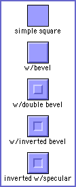
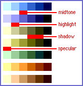
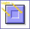
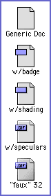
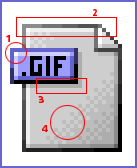
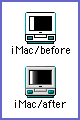
Part Three: Details, Details... By Dave Brasgalla You've successfully made your first icon with ResEdit... aren't you proud of yourself? You've done very well! But now, you might be thinking "Why doesn't my icon look as slick as the icons made by (insert favorite artist here)?". The answer is that, once the basics of constructing the icon have been mastered, the icon's impact rapidly becomes a matter of personal style in detailing - and that's what this installment is about. We'll show you some of the basic detailing techniques and how to employ them. Across the Third Dimension... So far your icon is only 2-dimensional - it has height and width. But detailing mostly involves *depth* - or the illusion of it! One of the most most common effects you will see on the Web is beveling. Beveling is the effect of the edges of the icon being raised from the surface of the Desktop. There are filters in Photoshop that do this for you, but you should learn the technique yourself, especially since it is not hard. Figure 1 shows how to take a simple square icon and add a beveled edge. Simply take a lighter shade of your main color and highlight the top edges, then use a darker shade to do the same on the bottom. The third icon shows a double effect, while the last icon rotates the center 180 degrees for an inverted effect. Simple, but very vivid and fun! Notice that I used the top and left edges for the lighter shade? I'll explain that next. (note: I put together a few color gradients that work well for this kind of thing - see Figure 2) "Lights!" One the most important aspects of an icon is the "lighting". Many top icon artists use special lighting techniques to achieve their unique effects. To become proficient at doing this, the first question you have to ask is "Where is my light source?". If you adhere to the standard Mac OS technique that has been in use for many years now, the light "shining" on your icon will be coming from the top left, as if a lamp or the Sun was positioned there and the light is coming down diagonally across your icons. Visualizing this will help you determine how to apply highlights. Look at the close-up in Figure 3 to see an example of this. To really make this effect work for you, it's good to add tiny touches, like "speculars", which occur when a sharp edge like a corner catches a bit more light than anything else. This makes a hot spot. Notice the tiny pixels of pure white in the corners. They are subtle, but they make a more realistic surface - great for a plastic-like texture! Doctor a Document Let's put some of these effects to work in a single icon. We'll use a generic "Document" type of icon (Figure 4). The first thing to do is add a "badge", which we'll use to designate this particular icon as a GIF file icon. The badge will also help increase the 3D effect by giving us more places to employ shading and highlights. Make sure the badge is at least 9 pixels high, which will give us a one-pixel border, 5 pixels to make letters with and 2 more for lighting effects. In the third icon, you can see where to add the highlights and shadows, assuming that the light is coming from top left. Don't forget to use the darker shadow color to add a shadow *underneath* the badge. This makes it look like it is floating over the rest of the icon. At this stage, the icon is looking pretty good! Let's add those speculars in the top left corners. You might also want to put a correspondingly darker pixel in the bottom right corners, to accentuate the effect. Say, is that OS 8.5? Your icon is turning out well for 256, but of course, everyone is buzzing about 32-bit icons these days, right? Even if you don't have OS 8.5 or OS 9, you can get close to that 32-bit look by carefully adjusting some parts of the icon. Look at Figure 5. See how I took the black outline of the icon and used the greys to lighten it towards the top left? This gives a softer edge, more like an 8.5/9 anti-aliased edge - although it might look a little funny against a black or dark desktop. You'll have to decide what you like. For a final touch, I did some very careful work in the body of the "document", using a grid-style pattern to darken the greys towards the bottom left. This trick takes a little practice (and a lot of squinting) to master, but it's a good one to know. The result is not quite a slick and smooth as a real 32-bit gradient, but when you put all these techniques together, it's pretty darn close! Playtime! Well, these techniques should give you a headstart into detailing, and feel free to experiment to find out what works best for your tastes. For example, when you have mastered the "upper left light" technique, try one from the upper right, or bottom right. Play around with it, and remember that there are no hard and fast rules - you can do whatever looks good to you! As a final aid, I've included a ResEdit version of last installment's iMac icon with these techniques applied to it (Figure 6), along with all the other icons used in this chapter. Go ahead and open it up in ResEdit to compare what I added with the original icon - then try it yourself. It's really not as hard as it looks, and your icons will look fabulous! Next installment, we'll take a look at Copland and how to tame those odd angles... |
|
copyright©19999 The Iconfactory, all rights reserved